


OVERVIEW
The Seattle Asian Art Museum (SAAM), part of the Seattle Art Museum (SAM) group, is in a renovated Art Deco building in Volunteer Park. Recently, it revamped its collection layout, organizing exhibits by themes instead of geographical regions, making it unique in the U.S. This thematic approach emphasizes Asia's diverse cultures, histories, and beliefs, allowing visitors to explore a wide range of Asian art and stories.
CHALLENGE
How can we create a unique brand identity for the Seattle Asian Art Museum (SAAM) that sets it apart from its parent brand, the Seattle Art Museum (SAM)?
SOLUTION
The museum's historic Art Deco structure inspired this new branding. Based on the main entrance of the building, the logo incorporates the silhouettes of the letters M for Museum, A for Asia, and A for Art, thus creating a symbol that expresses the unity of Asia and the museum's presence in Seattle.
-
Brand Identity
Layout Design
-
Illustrator
InDesign
Photoshop
Figma
-
12 Weeks
-
Solo (Team Research Done with Stephanie Vasquez, Adnan Mohamed, Aj Tuan Le, and Paola Eligio Romero)
CONCEPT BOARD

TONAL TERRITORIES


LOGO ITERATIONS


BRAND APPLICATION


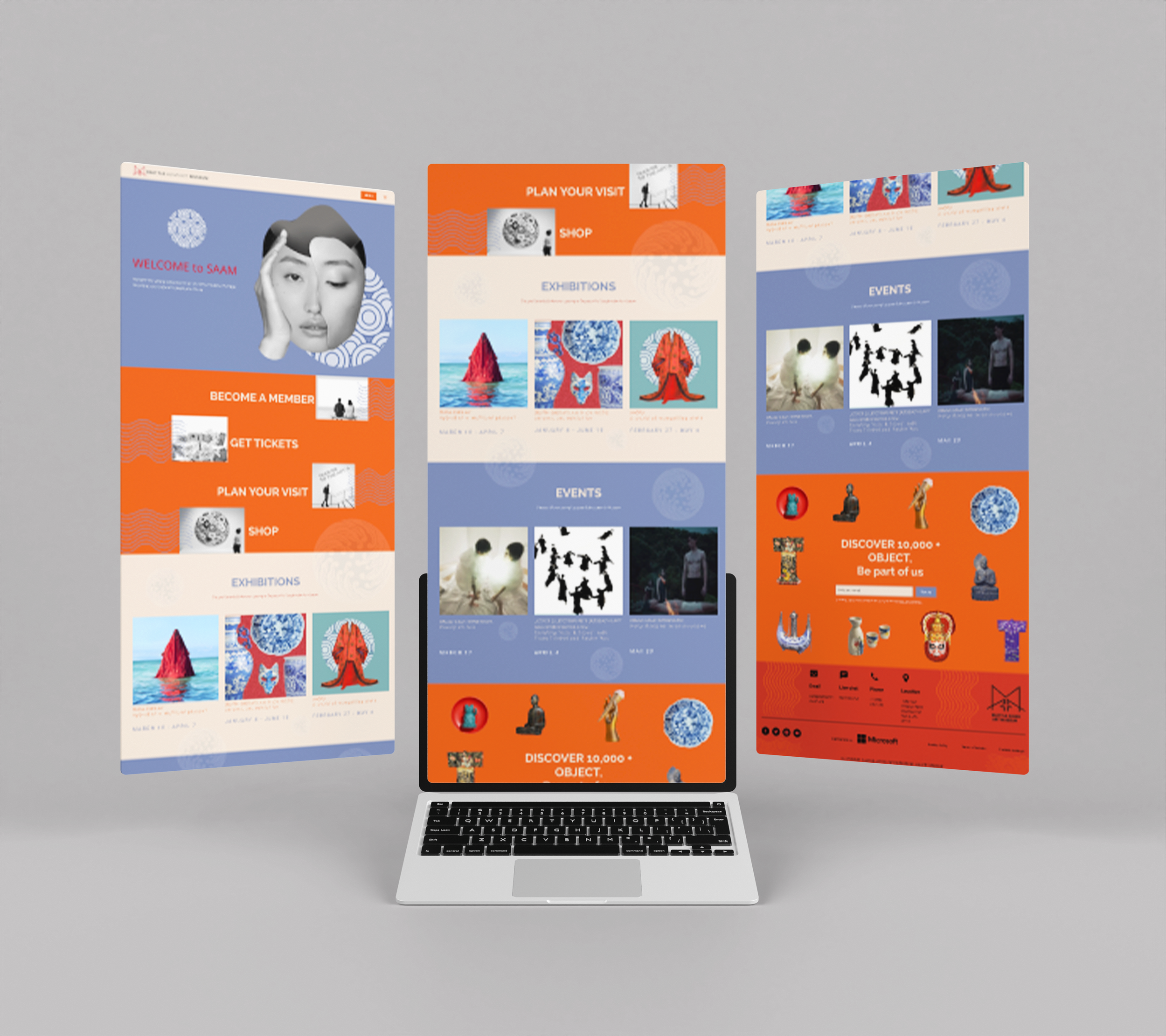
WEBSITE LAYOUT

BrandBook


